Fitness & App designMay 27, 2026
Bloomfit - Fitness Tracker App
 Dhaval AgrawalDhaval Agrawal
Bloomfit is a simple fitness app for people who want to stay active without the stress of intense tracking. This is how we figured out what that really meant to create.
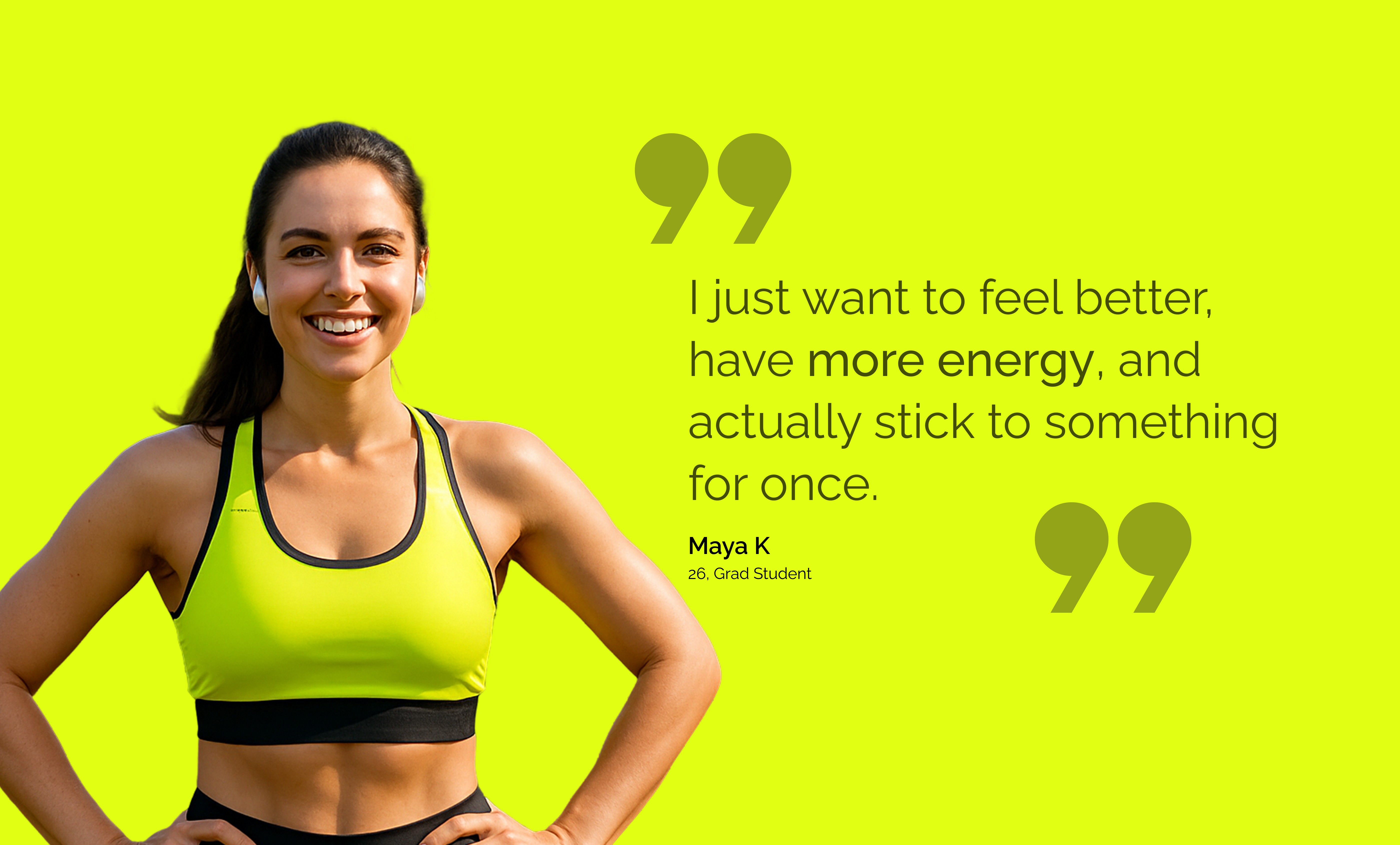
Most fitness apps target people who are already motivated. They focus on power users streaks, leaderboards, and detailed macros. For everyone else, they can be intimidating or shameful.
The brand name symbolizes gradual, natural progress a bloom, not a burst. The visual style had to reflect this: warm, relaxed, and genuinely encouraging.
We conducted a focused four-phase process. The constraint was intentional: no phase could start until the previous one clearly answered its main question. Phase 1 was "who is this really for?" Phase 2 was "what should the flow feel like?" Only then did we delve into visual design.
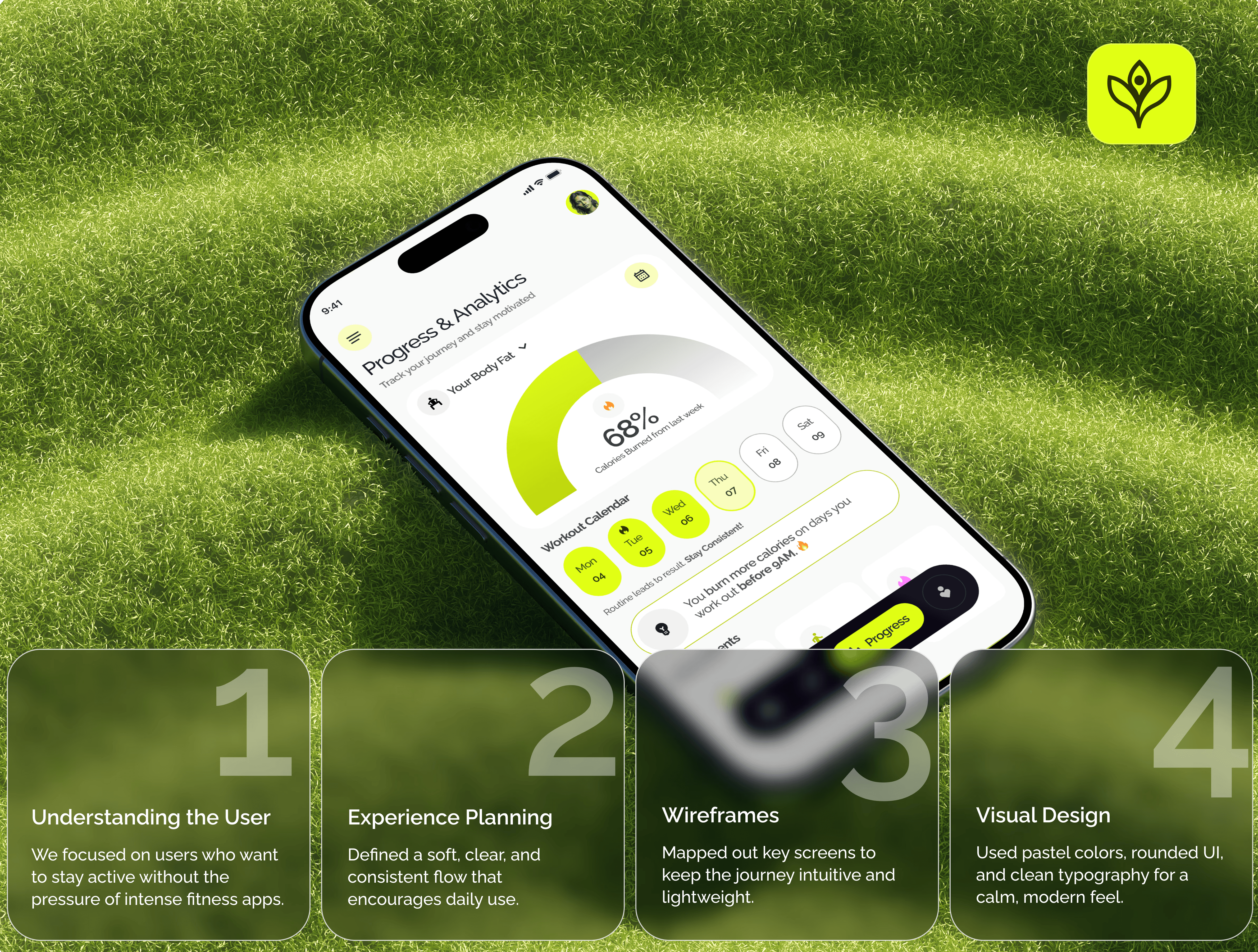
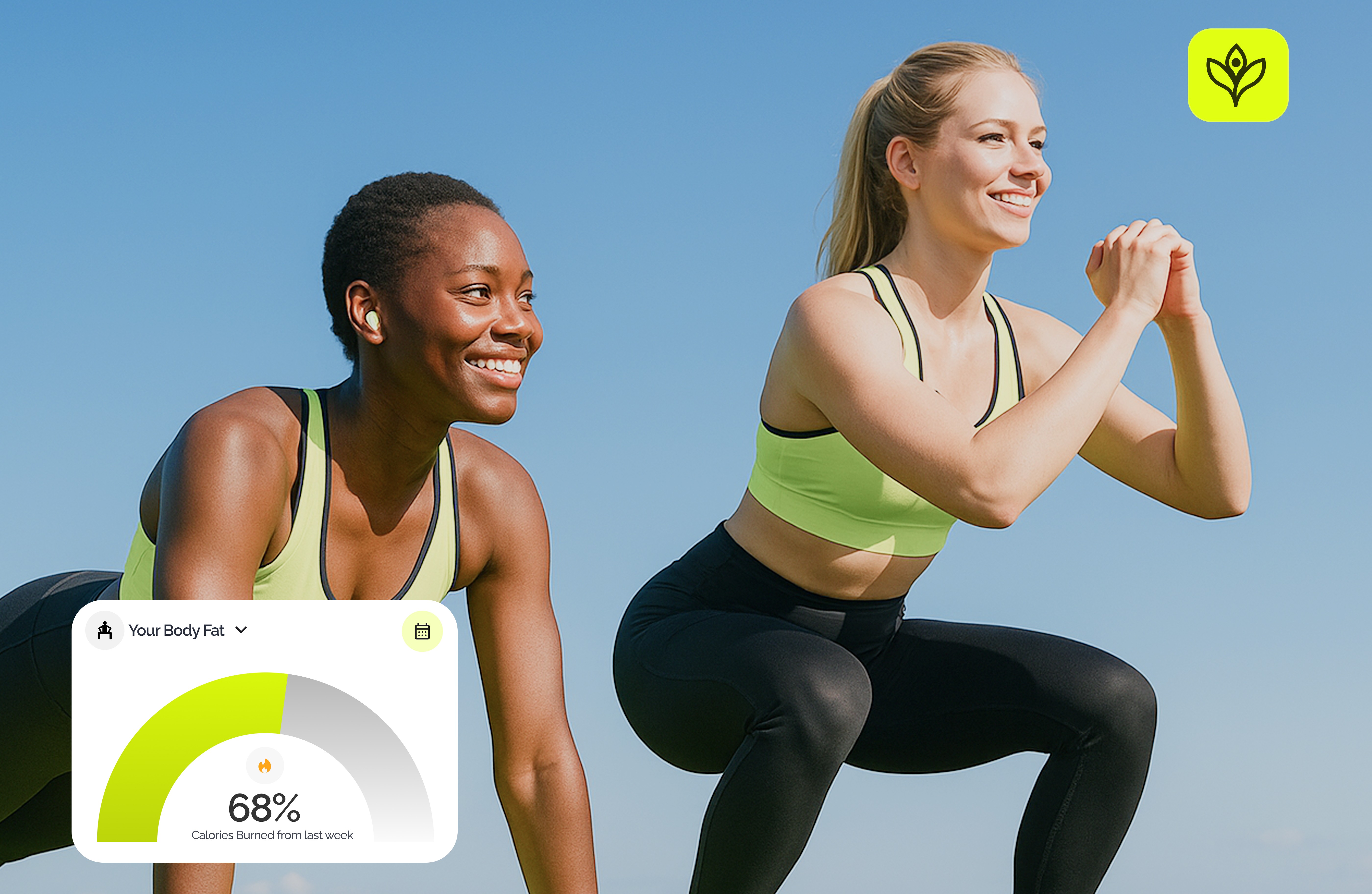
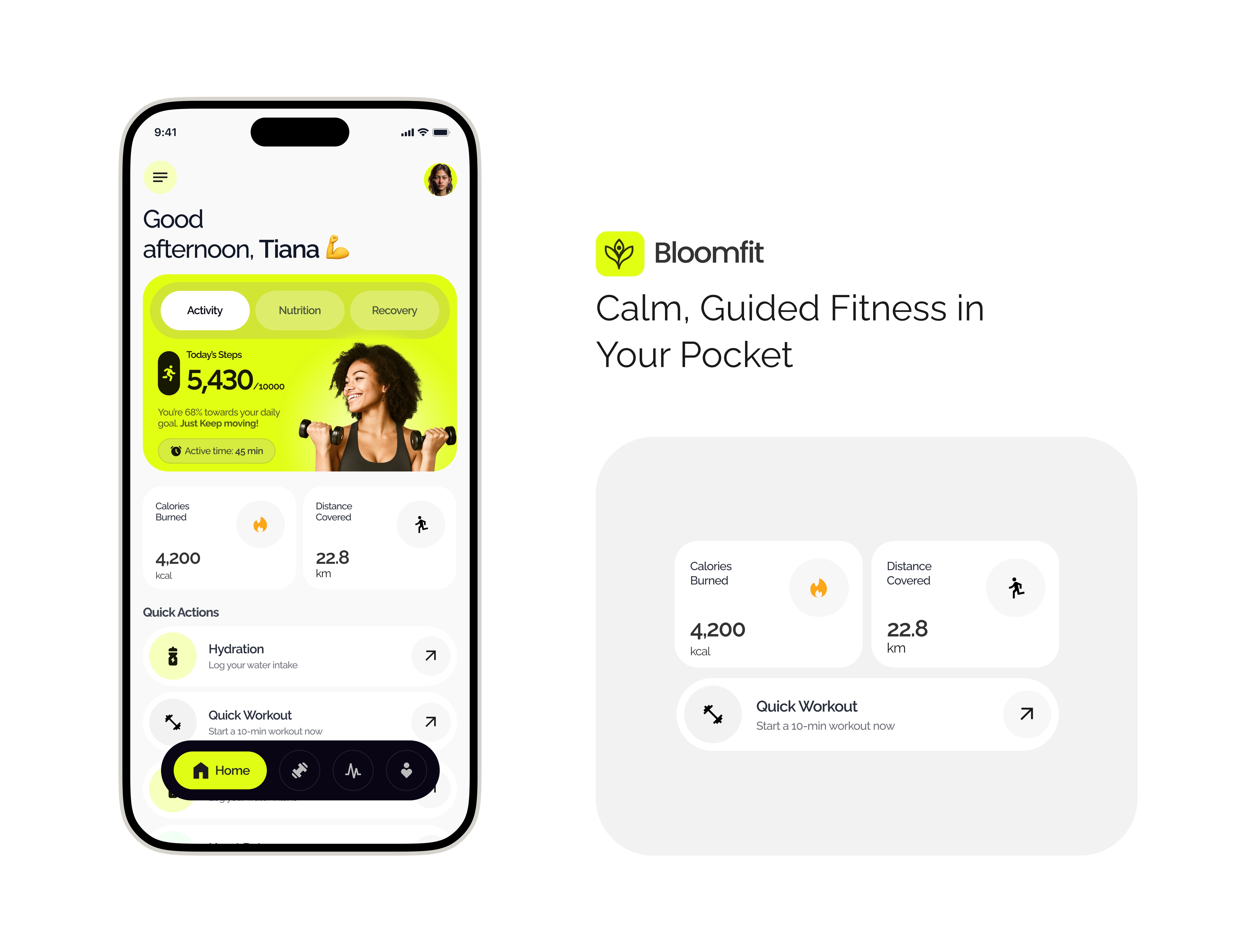
The decision about information architecture was the most impactful one we made. The norm for fitness apps is to show everything macros, heart rate zones, body composition, sleep data. We pushed back against that. The main user flow centers on four primary destinations: Home, Workout, Progress, Profile.
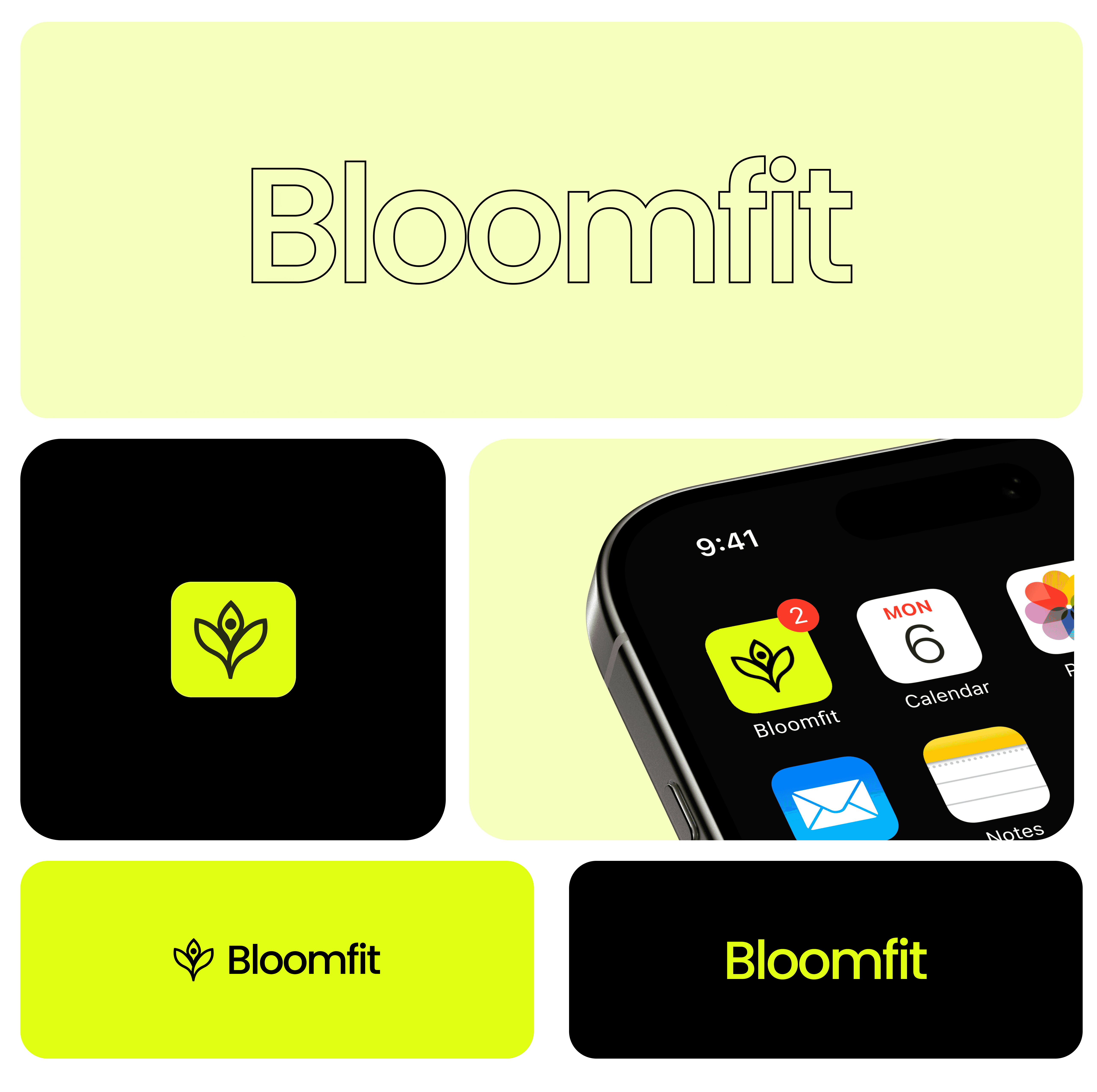
We selected Raleway as the one typeface for the app and brand. It has a geometric style without being cold, and its range of weights — Regular to Black provided enough variety without needing a second typeface. JetBrains Mono is used for metadata, labels, and captions throughout the system.
The logo a stylized bloom or lotus looks good at 16px in a navigation bar and at 512px in the App Store. We tested its appearance on various backgrounds and at small sizes on an actual phone's home screen before final approval.
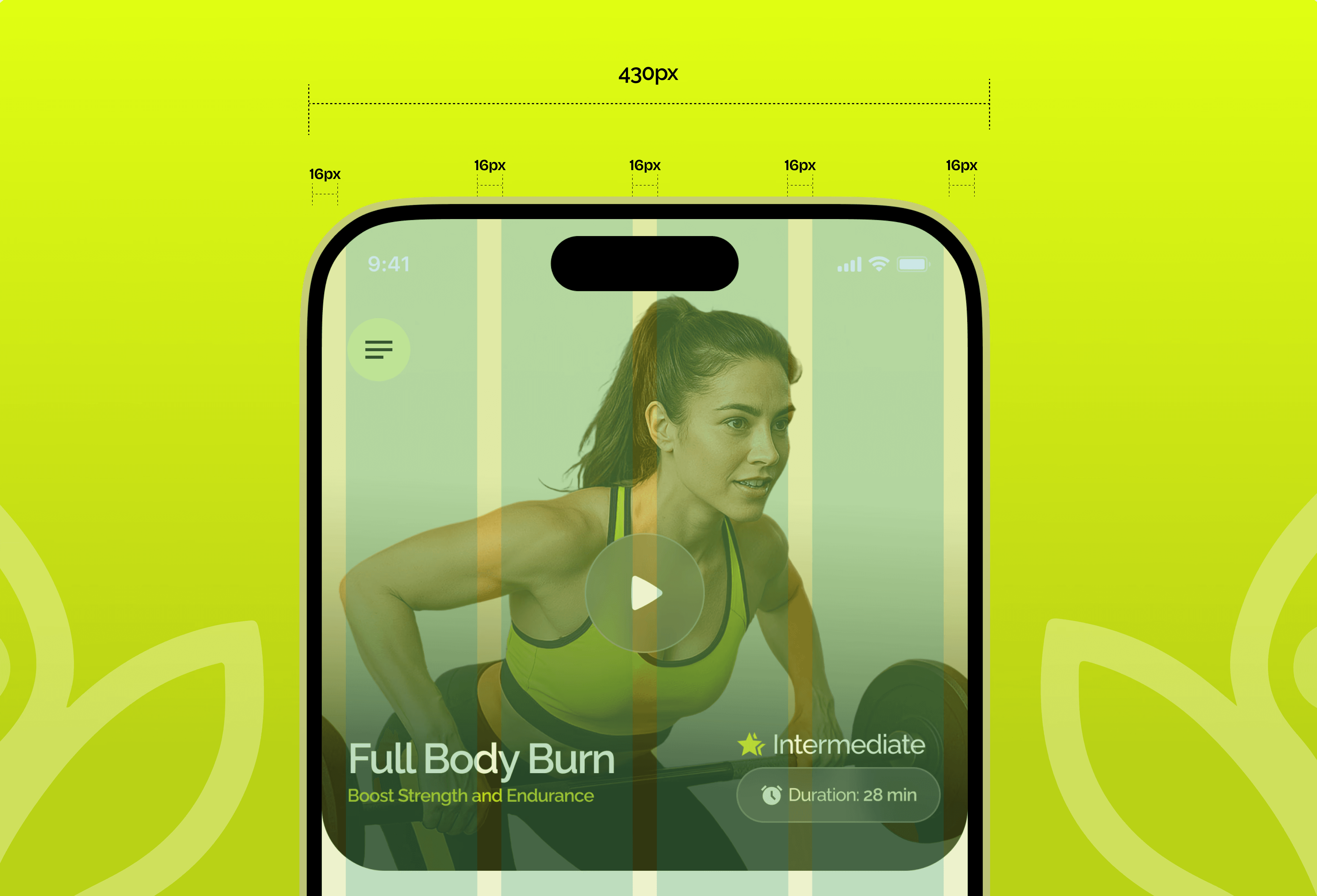
Bloomfit was designed mobile-first on a 430px canvas (iPhone 14 Pro Max) with a 4-column grid and 16px spaces throughout. This approach was practical, not just aesthetic. Consistent spaces meant any developer working on it knew exactly where content belonged. No guesswork.
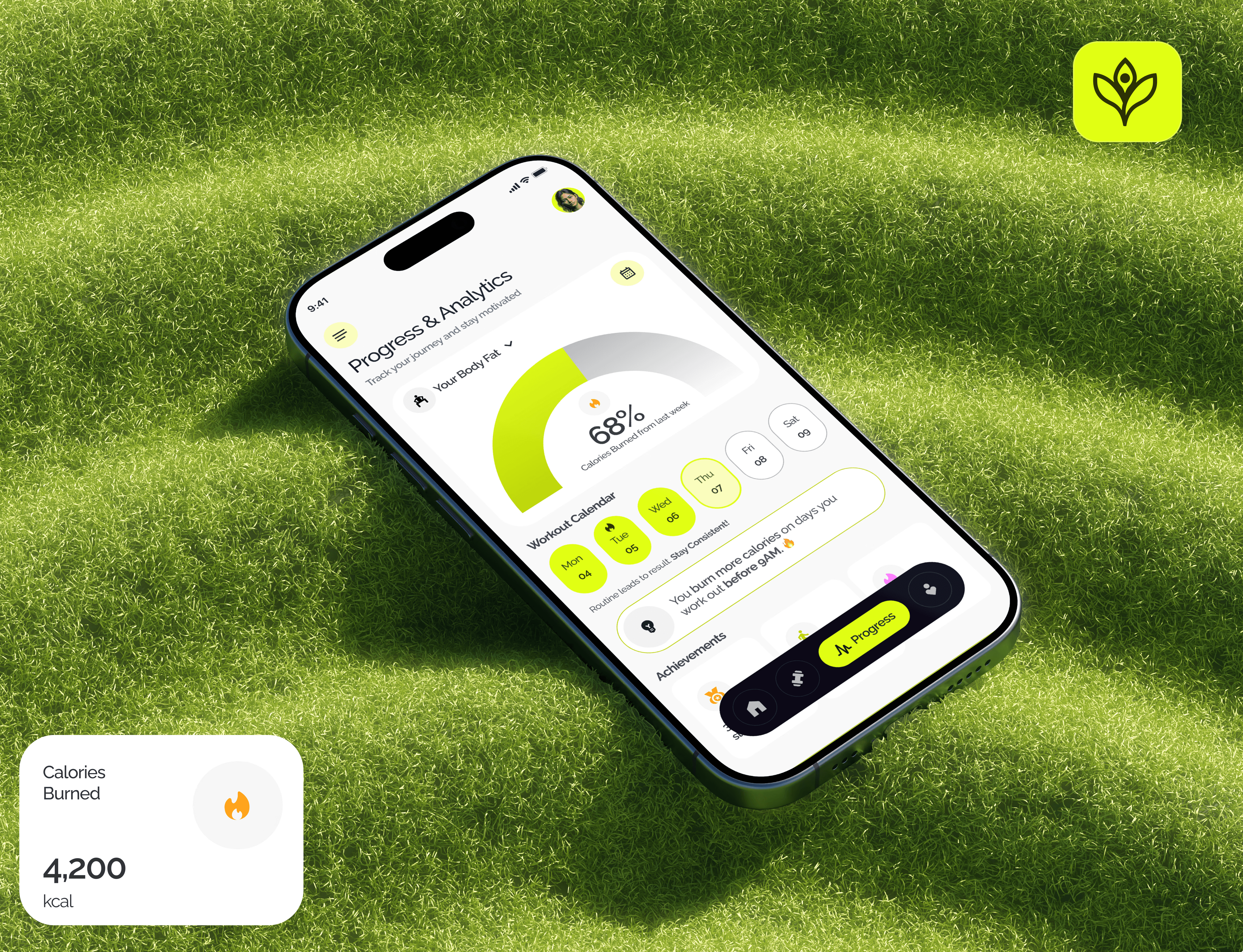
In the final design, we included about 18 screens. However, someone only needs to see three to understand the product fully: the Home dashboard, the Exercise session view, and the Progress tracker. Everything else in the app supports these three.
The Exercise screen minimizes distractions while users work out. The list-with-timers format came from user input: people didn't want to think about what to do next. Designing the Progress screen was the toughest six iterations led us to the radial gauge format for body fat percentage, as other attempts felt too clinical.'
Onboarding is the area that stands out. We spent most of our time refining the experience after onboarding — the screens users see daily — and treated the initial flow as already solved. It isn't. In a fitness app, onboarding is crucial. It's where you establish an emotional connection with the user: this app will be different and won't judge you. We didn't design that moment with the same care as the Home screen.
