Smart Learn AI
Dhaval Agrawal
Learning
Teaching children isn't about filling a cup —
it’s about lighting a spark.
SmartLearn is an AI-powered learning app for children aged 2–6. We were brought in to design the complete product experience — from the first screen a toddler sees to the analytics dashboard a parent checks before bed. This is an honest account of how we worked, what we got wrong, and why we made the calls we did.
A learning tool that treats kids like kids — not tiny adults.
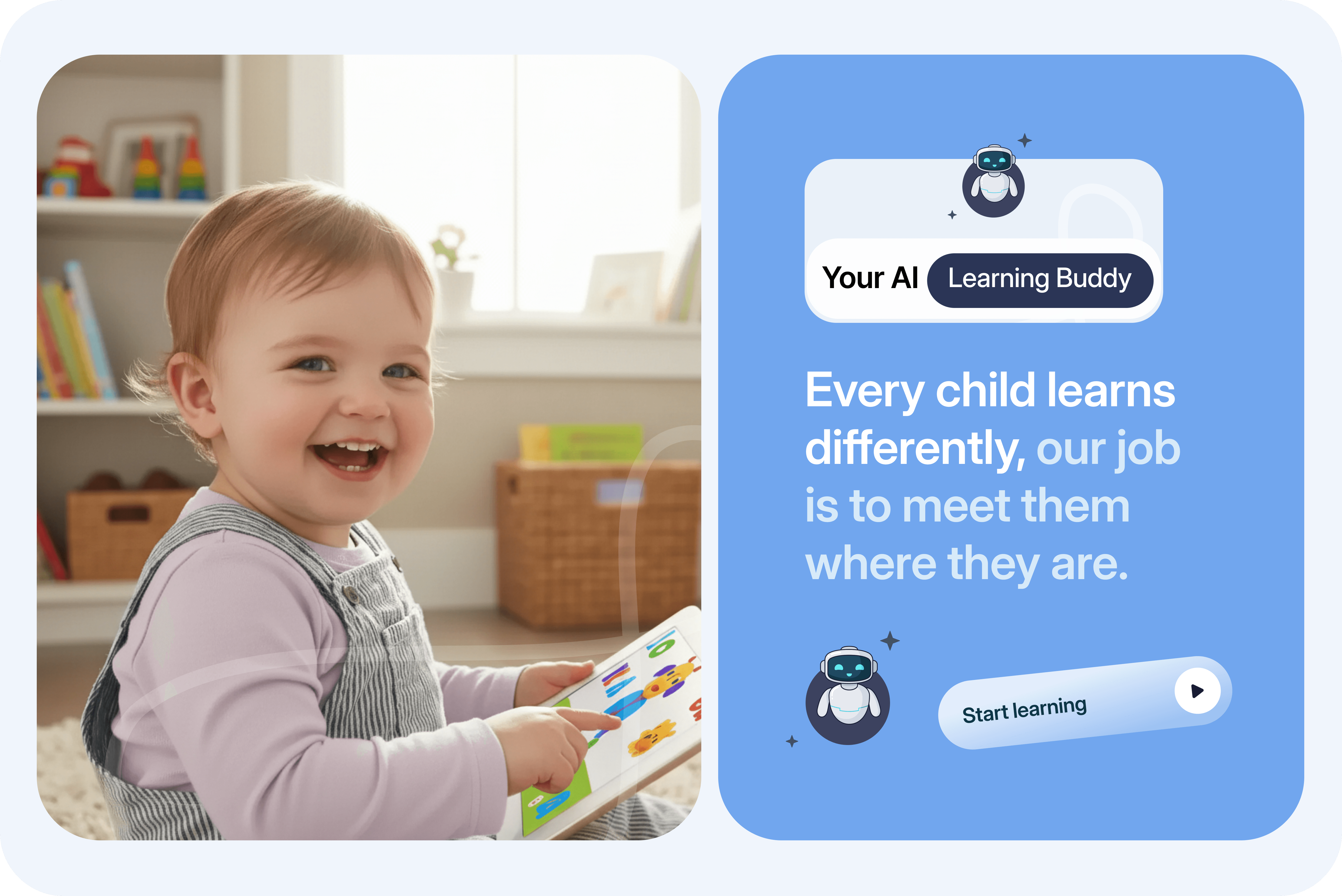
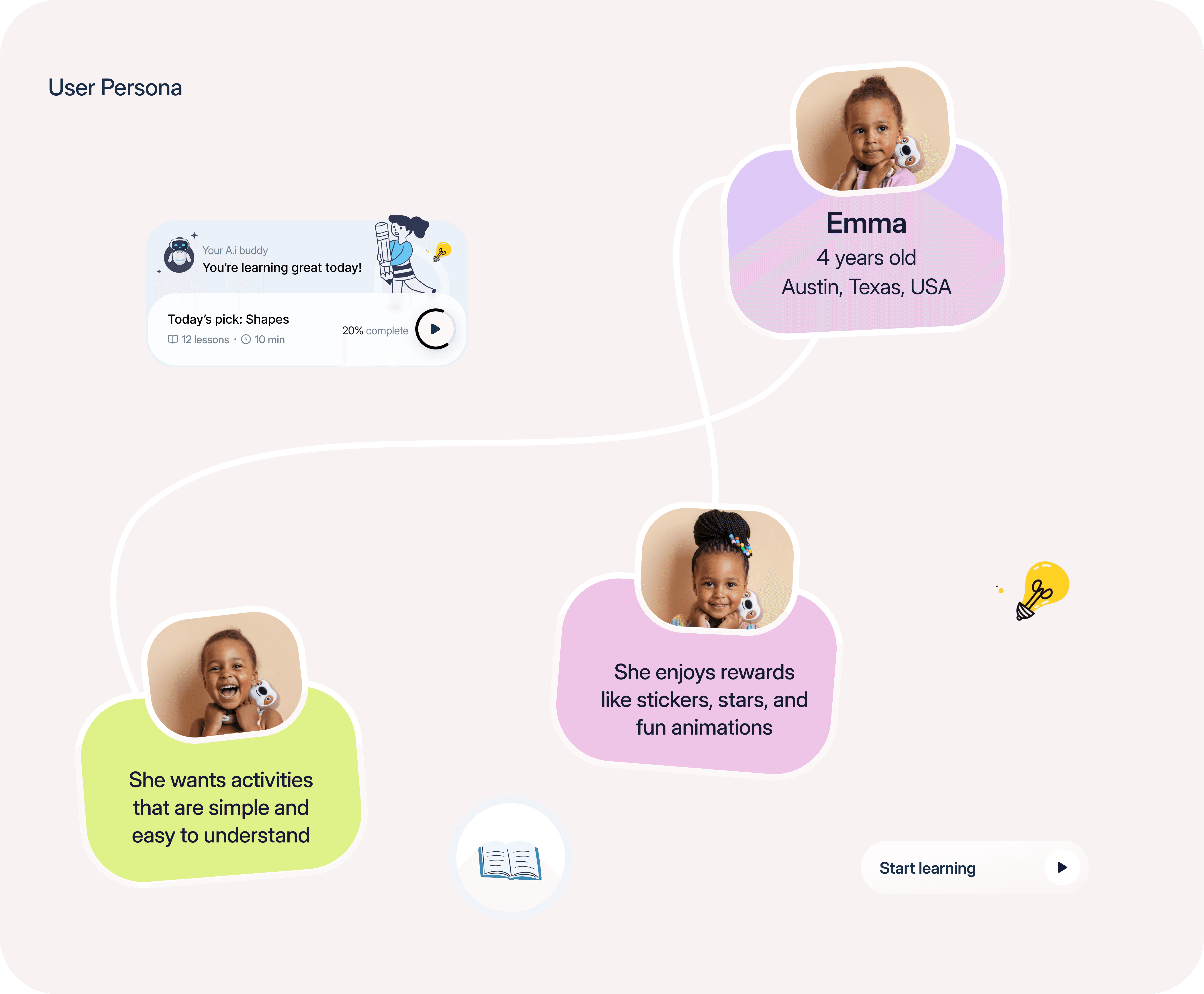
Meet Emma. She’s four years old and she has zero tolerance for confusion.
We spoke with parents of 16 children between the ages of 2 and 6. Across all those conversations, we kept hearing the same thing in different words: young children at this age don’t troubleshoot. If a button doesn’t do what they expect, they hand the tablet to a parent. They don’t retry. They don’t wait. They move on — and they usually don’t come back to whatever confused them.
We started grey on purpose. Color makes people argue about the wrong things.
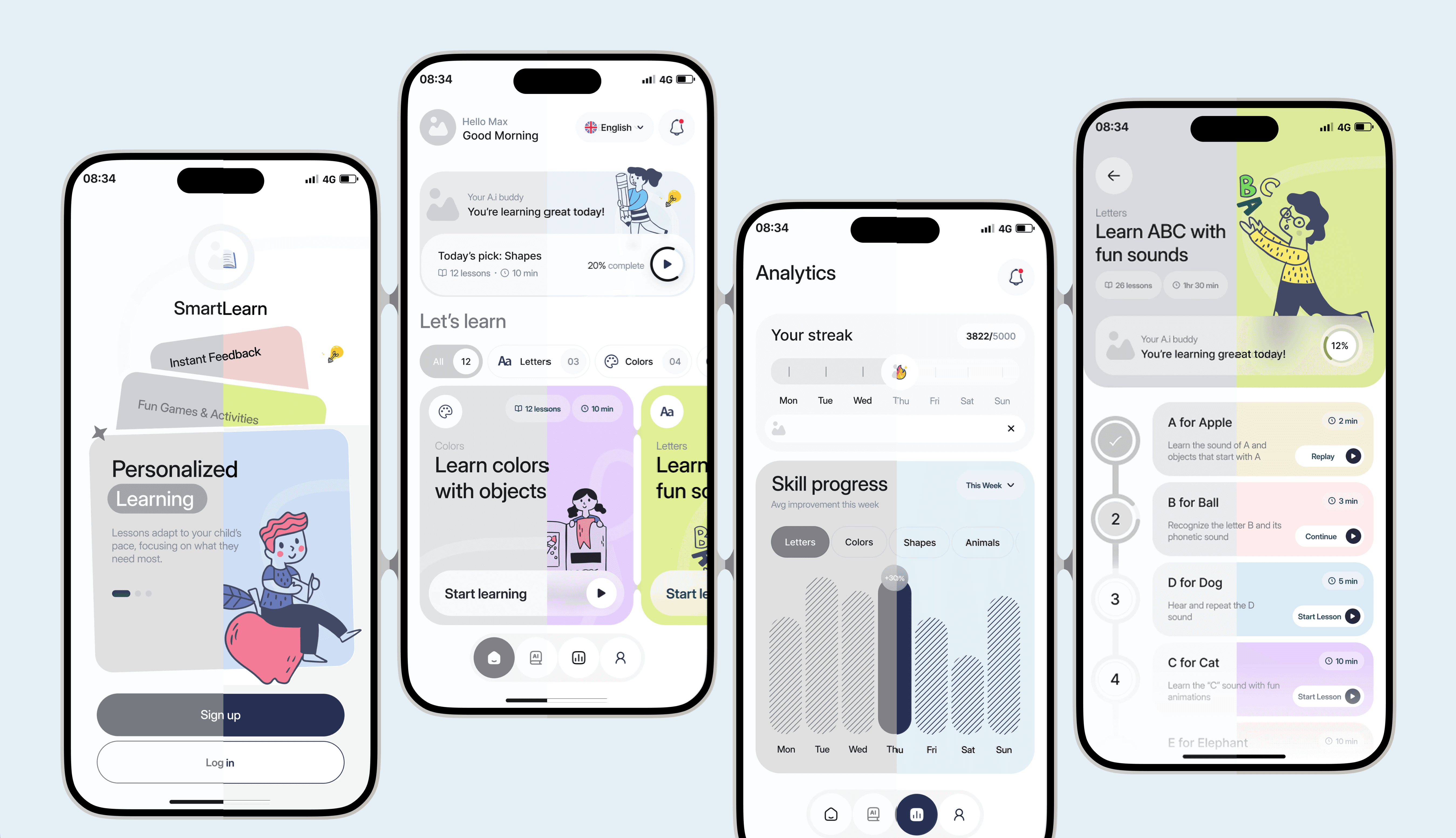
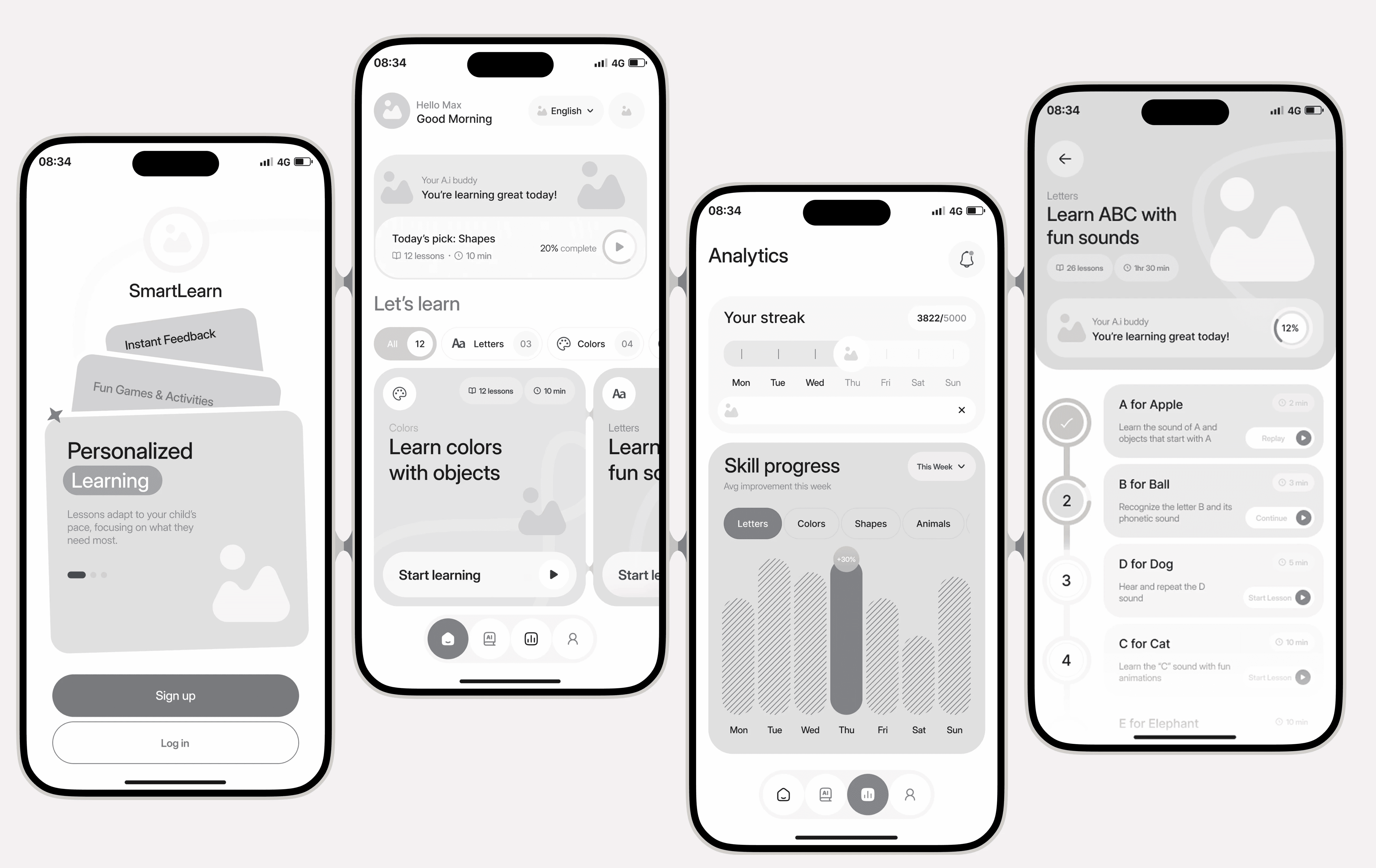
Before anyone opened a color palette, we built every screen as a grey wireframe. This wasn’t precious — it was practical. When screens look polished, the feedback you get is about font choices and corner radius. When screens look like rough placeholders, you get structural feedback. We needed the structural conversation first, and grey boxes are the fastest way to have it.
Turning grey boxes into something a four-year-old actually wants to touch.
Four screens carry almost the entire experience. We protected each one’s job fiercely.
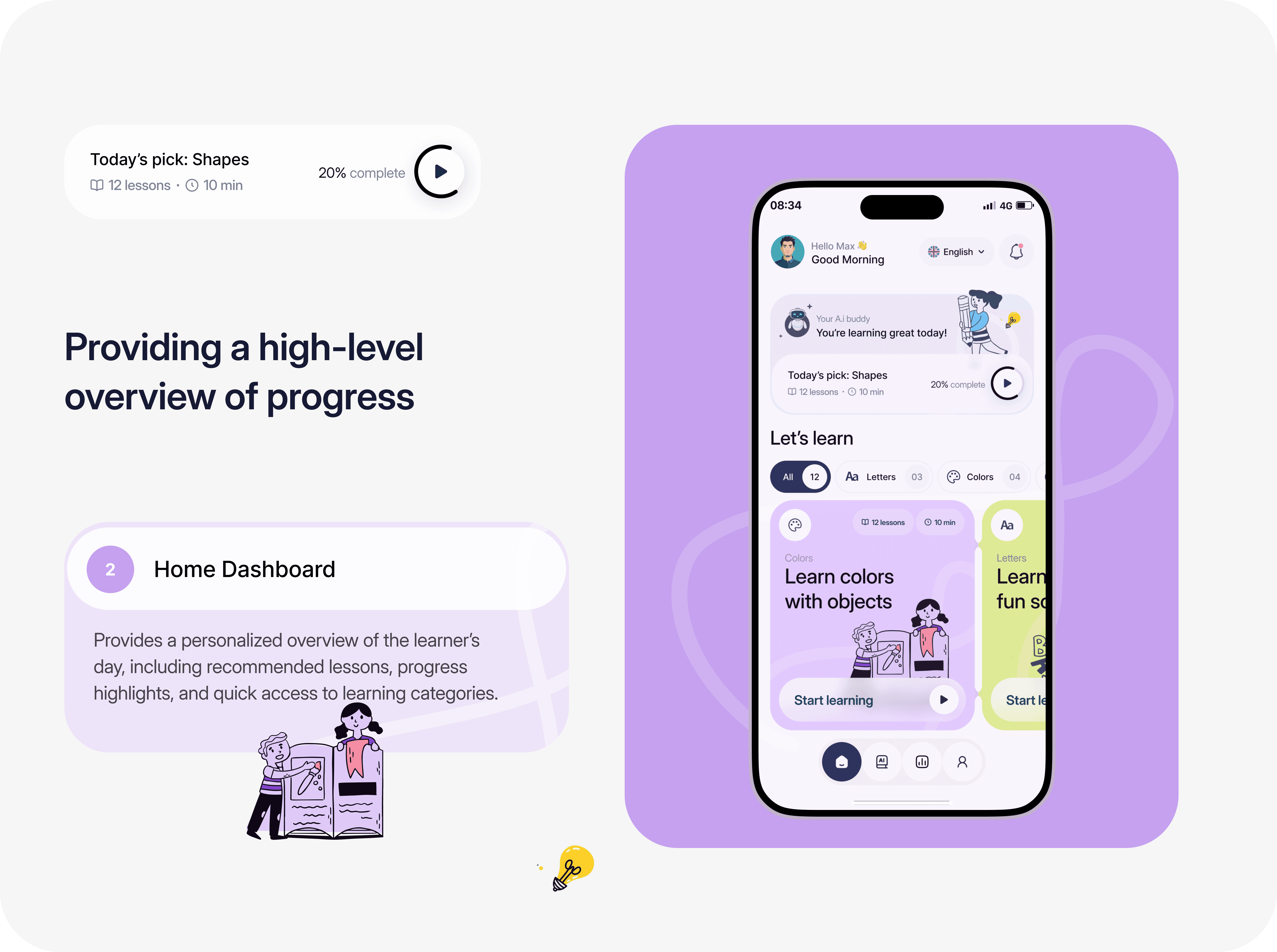
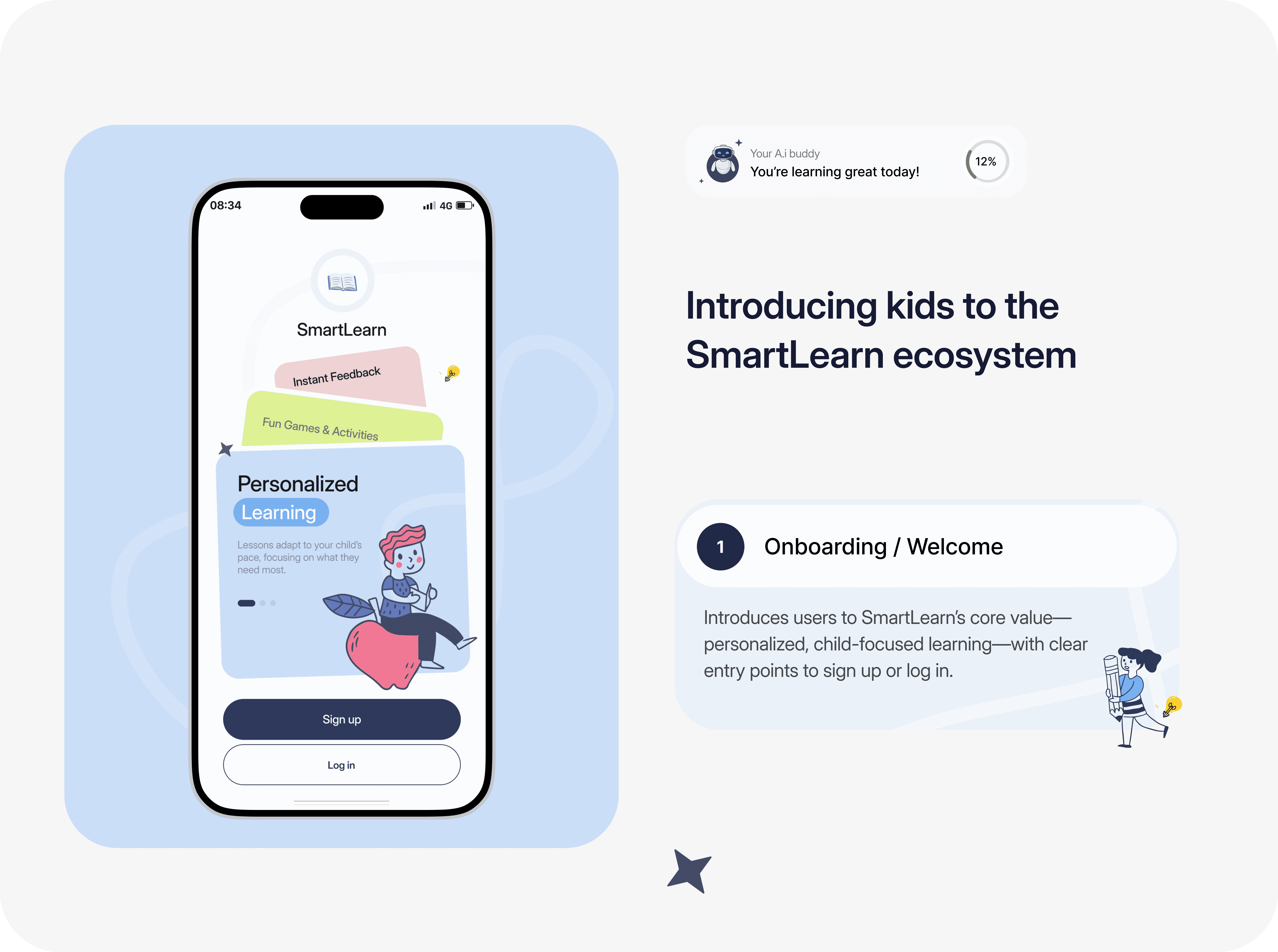
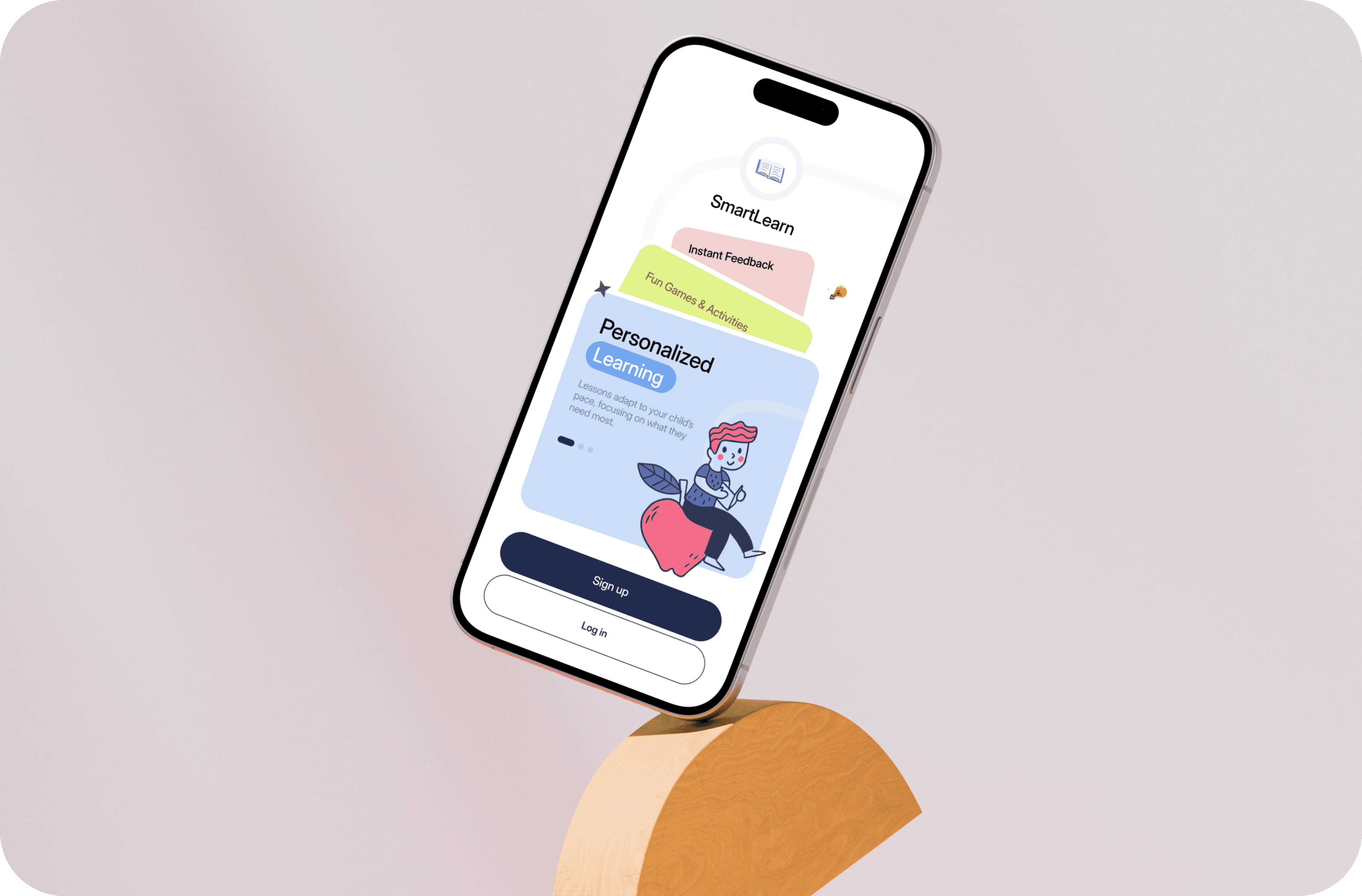
After wireframing, we realized the whole app lived or died on four screens. Not twenty, not a hundred. Four: the onboarding carousel that explains why SmartLearn exists, the home dashboard a child opens every morning, the lesson progress screen that keeps them moving, and the analytics screen their parent checks. Everything else in the app is either a sub-page of one of these or a transition between them.
The first thing you see needs to earn trust before it asks for anything.
The most visited screen in the app needed to do a lot while feeling effortless.
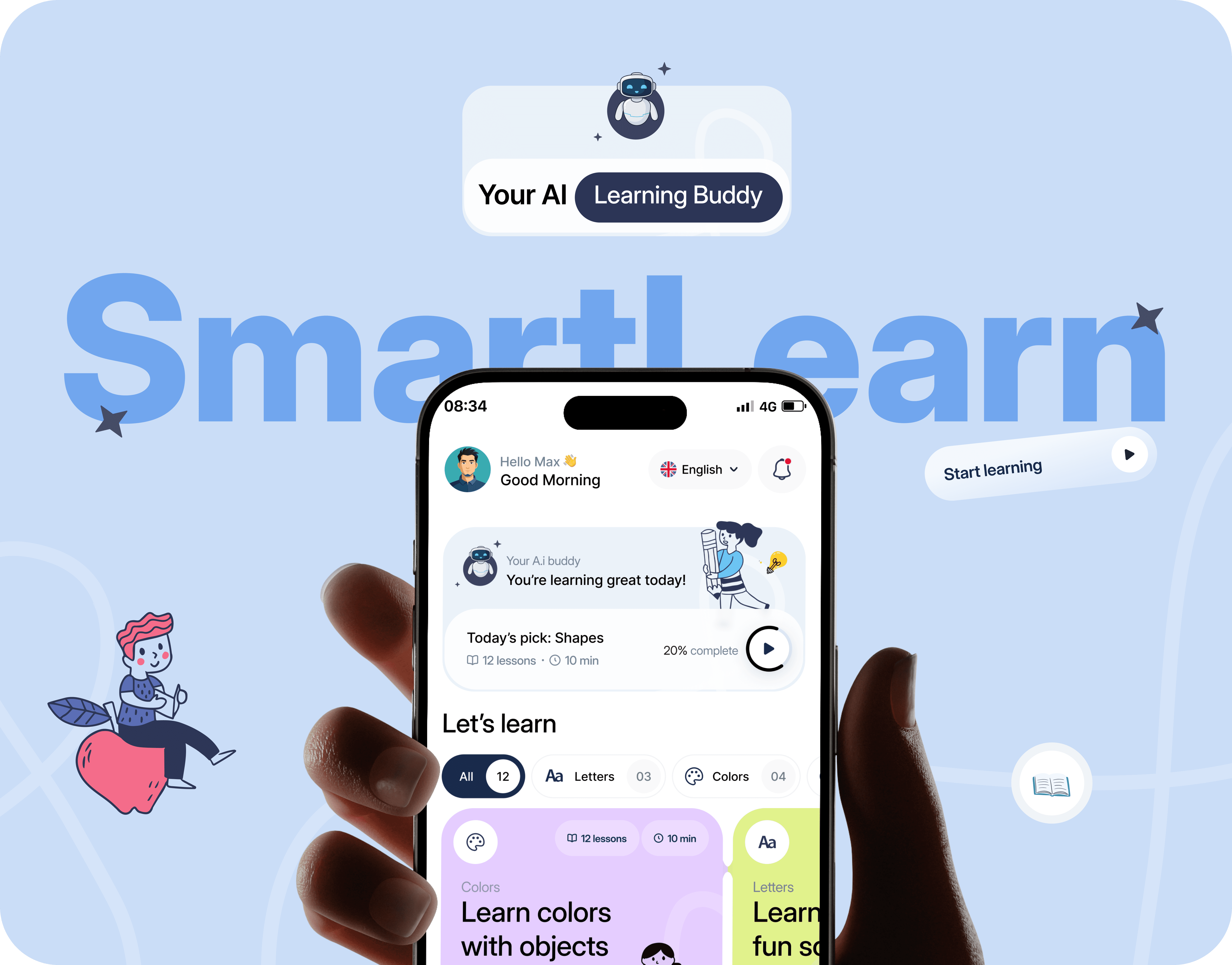
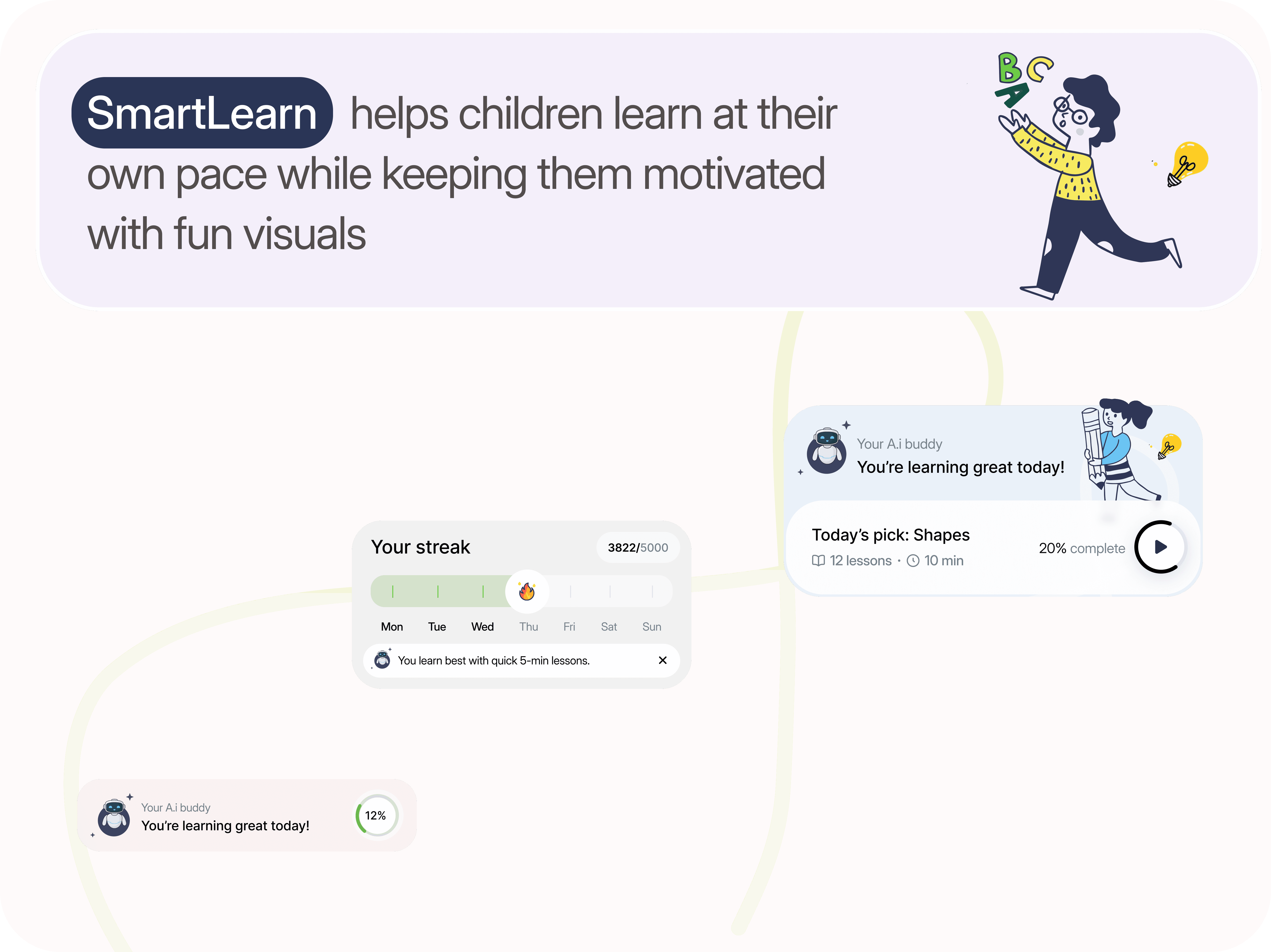
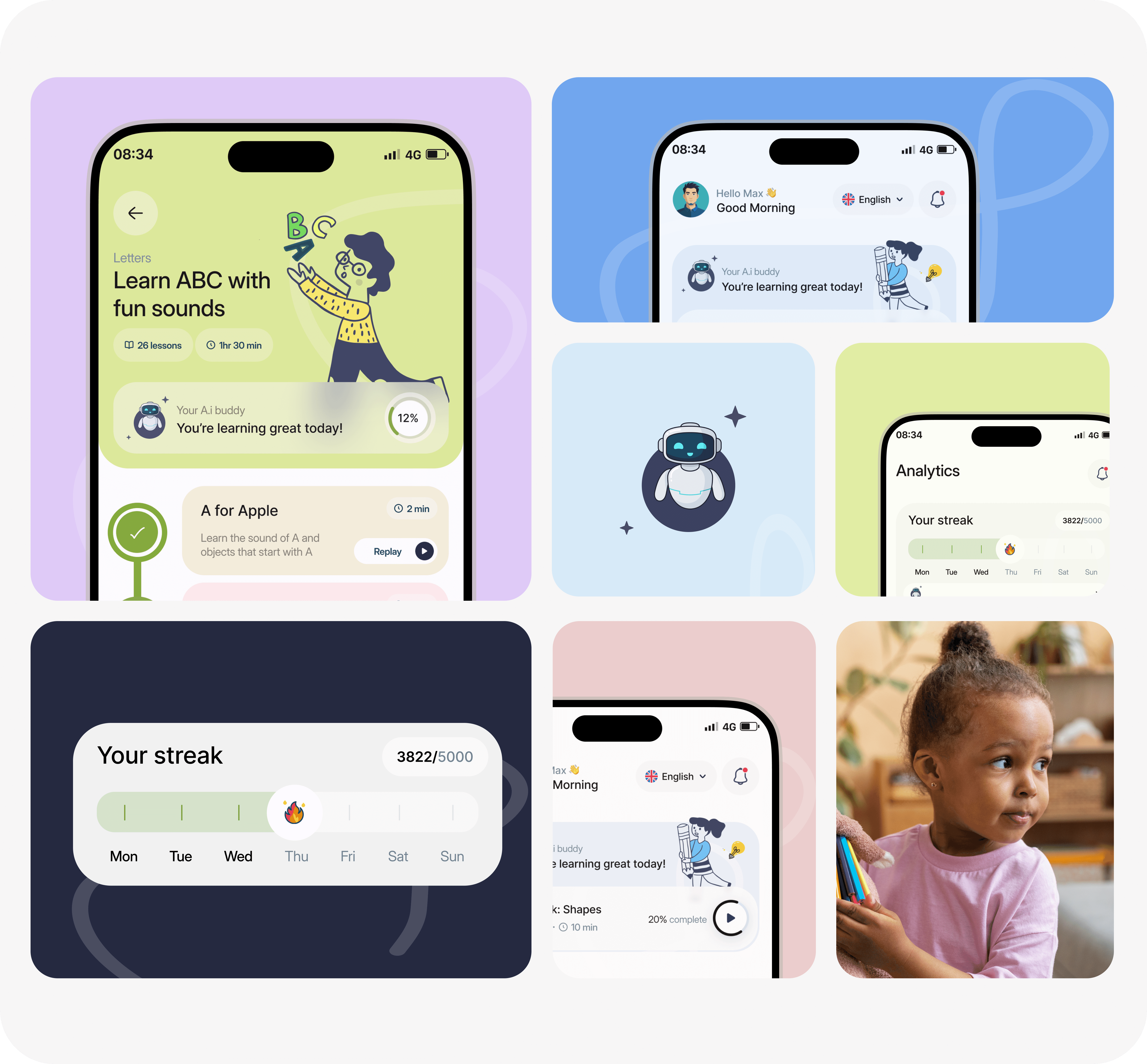
The dashboard is where a child lands every time they open the app. It surfaces the AI buddy’s daily recommendation, a progress nudge, and a scrollable grid of learning categories. “Today’s pick” was a late addition we almost cut for time — and it ended up being one of the most-tapped elements in early testing. Children would tap it immediately, before looking at anything else on the screen. When you’re four and choices feel overwhelming, a trusted recommendation is enormously valuable.
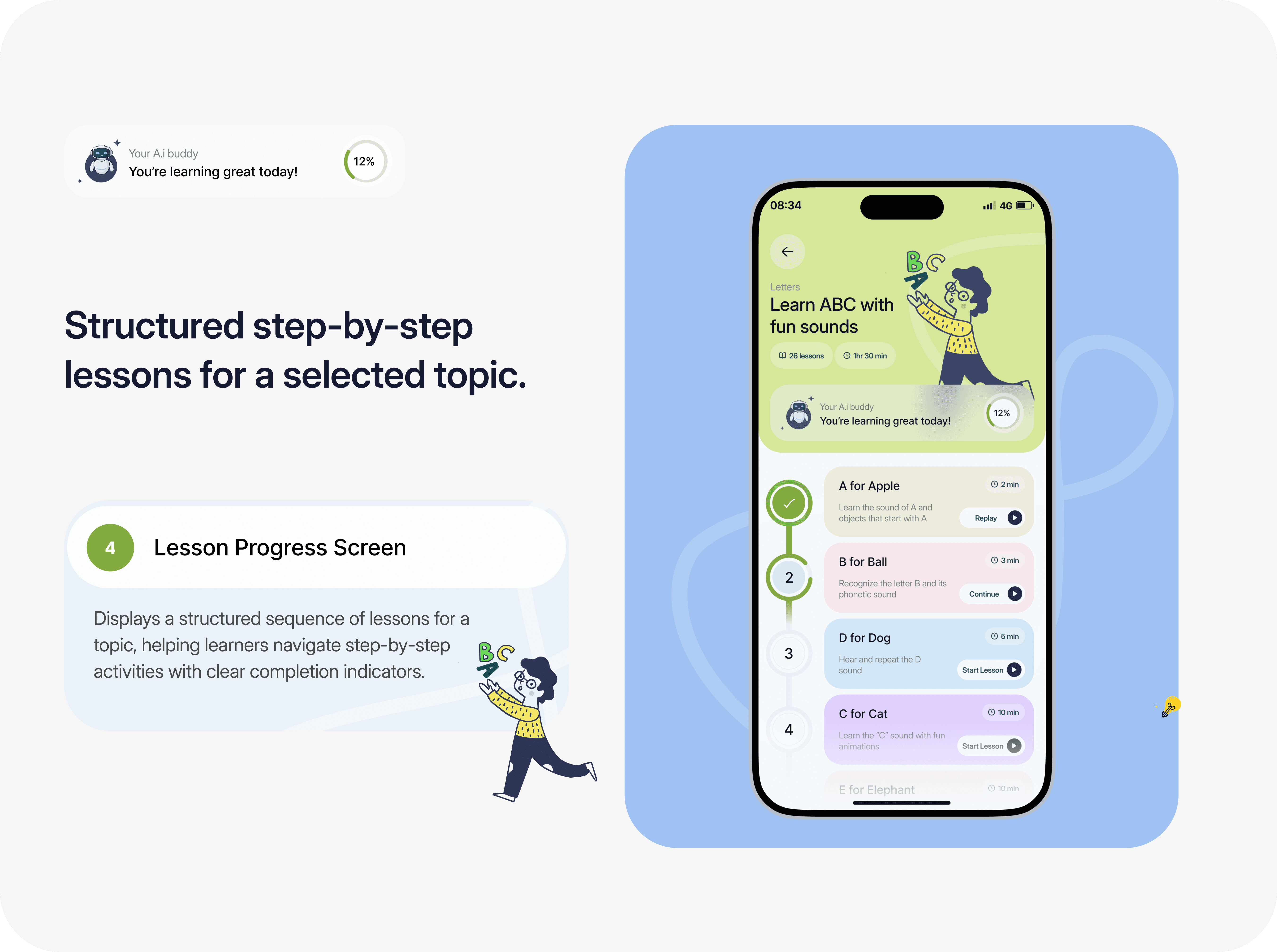
A child needs to see where they are, where they’ve been, and what’s ahead — all at once.
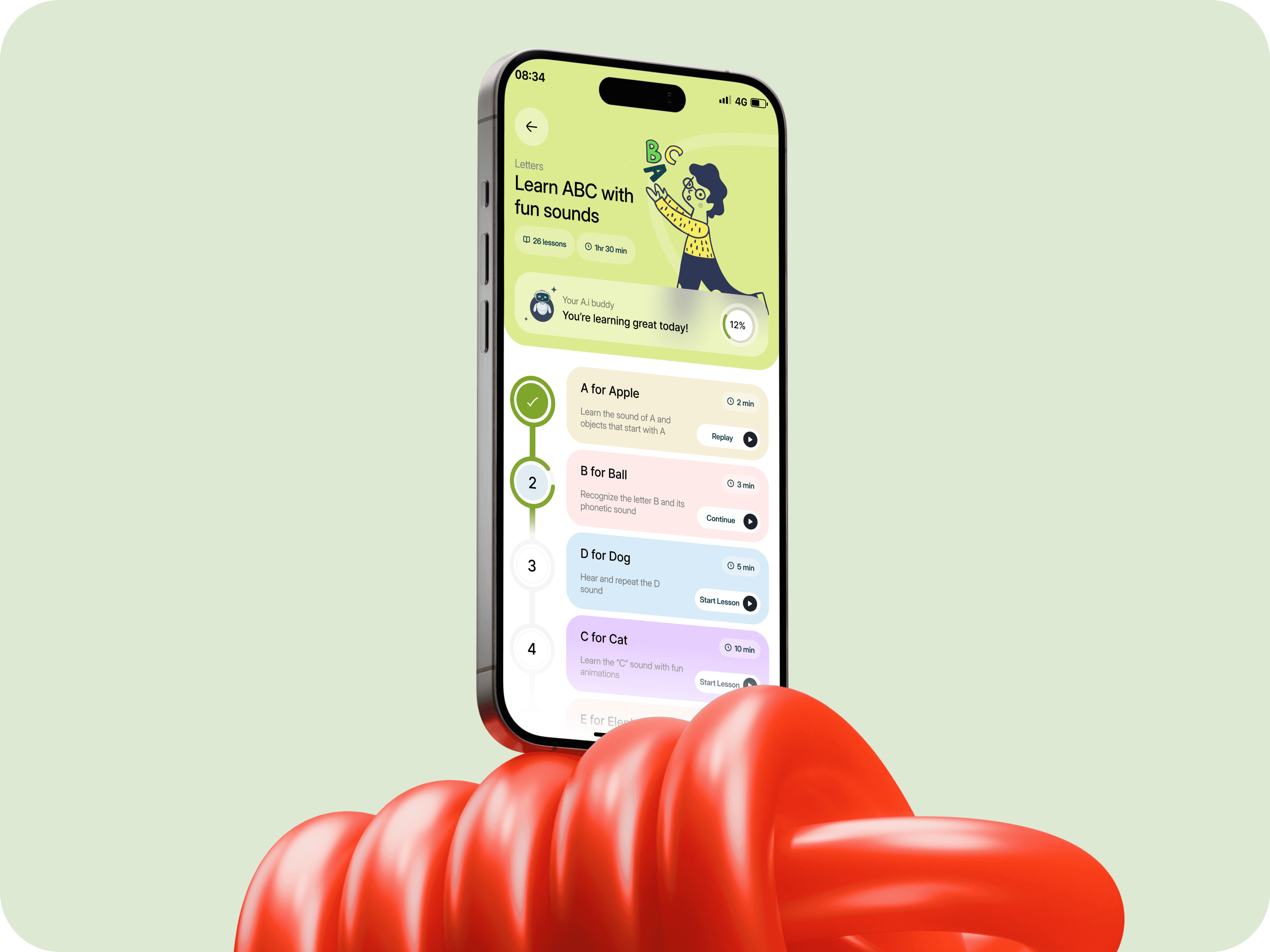
The lesson screen is a vertical timeline of steps. Completed lessons show a green checkmark. The current step shows a numbered ring with a clear action — Replay, Continue, or Start Lesson — depending on where the child is in the sequence. Future lessons are visible but visually quieter, which turned out to matter enormously. Hiding future lessons made children anxious; they kept asking if there was more. Showing them all in full made the list feel endless and heavy. The faded treatment struck exactly the right balance.
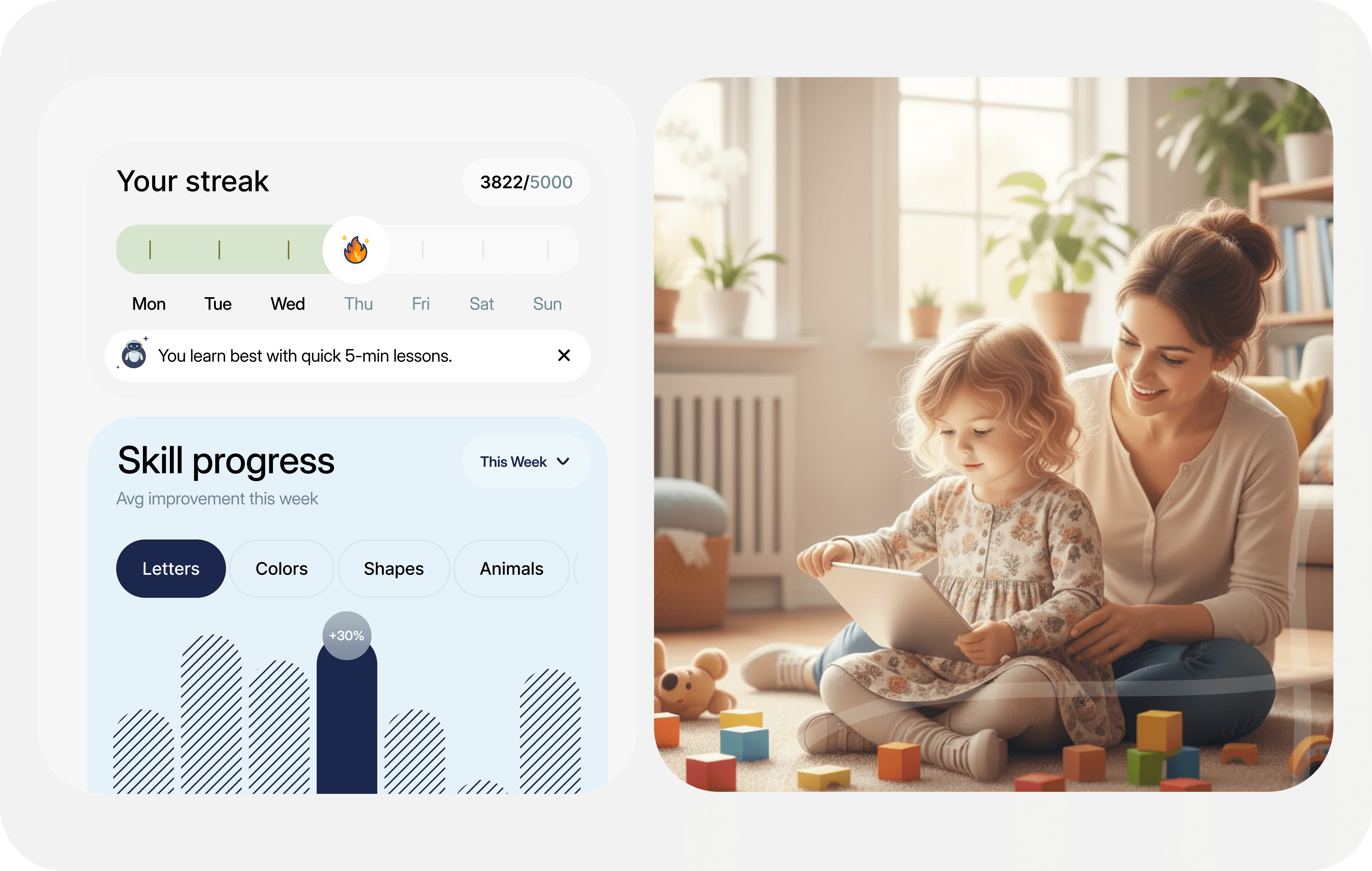
The streak is for the child. The chart is for the parent. One screen does both without confusing either.
The analytics screen has two halves that serve completely different emotional needs, and we had to design them to coexist without confusing anyone.
The streak tracker at the top is for the child. It’s also shown on the home screen, so by the time a kid reaches analytics, the flame icon and the green progress bar already mean something to them. We deliberately avoided marking missed days in red. The bar just shows unlit tick marks — a neutral absence, not a punishment. We tested the red-days version. Children didn’t like it. Parents didn’t like it. Nobody wanted their four-year-old to be visually penalised for a busy Tuesday.
Three honest things we’d do differently with more time.
We shipped with a version of the AI buddy that’s more of a recommendation engine than a true adaptive system. It gives useful nudges — “you learn best with quick 5-minute lessons” came up often in testing and landed well — but it doesn’t yet reorder lesson sequences based on individual progress patterns. That was a conscious scope decision, not a philosophical one. The infrastructure is there. We just ran out of sprint capacity to wire it up properly before handoff. It’s first on the roadmap.
“When learning feels fun, growth happens naturally — just like playtime.”
The best design for children disappears into the learning.