Skin careMay 28, 2026
ZYRA - Skincare Brand Identity Design
 Dhaval AgrawalDhaval Agrawal
Zyra came to us as a set of really good formulas with no face. Clean ingredients, honest science, and nothing to show for it visually. Here's how we gave it one.
The founder was tired of brands that cosplay as natural. Zyra had the opposite problem — the formulas were already good, green tea, centella, real plant-derived actives with research behind them. What was missing was a visual language honest enough to carry that story.
We had one constraint worth keeping: it had to feel premium without feeling untouchable. The kind of brand your most trusted friend would quietly recommend, not the kind that pays someone to pretend they use it.

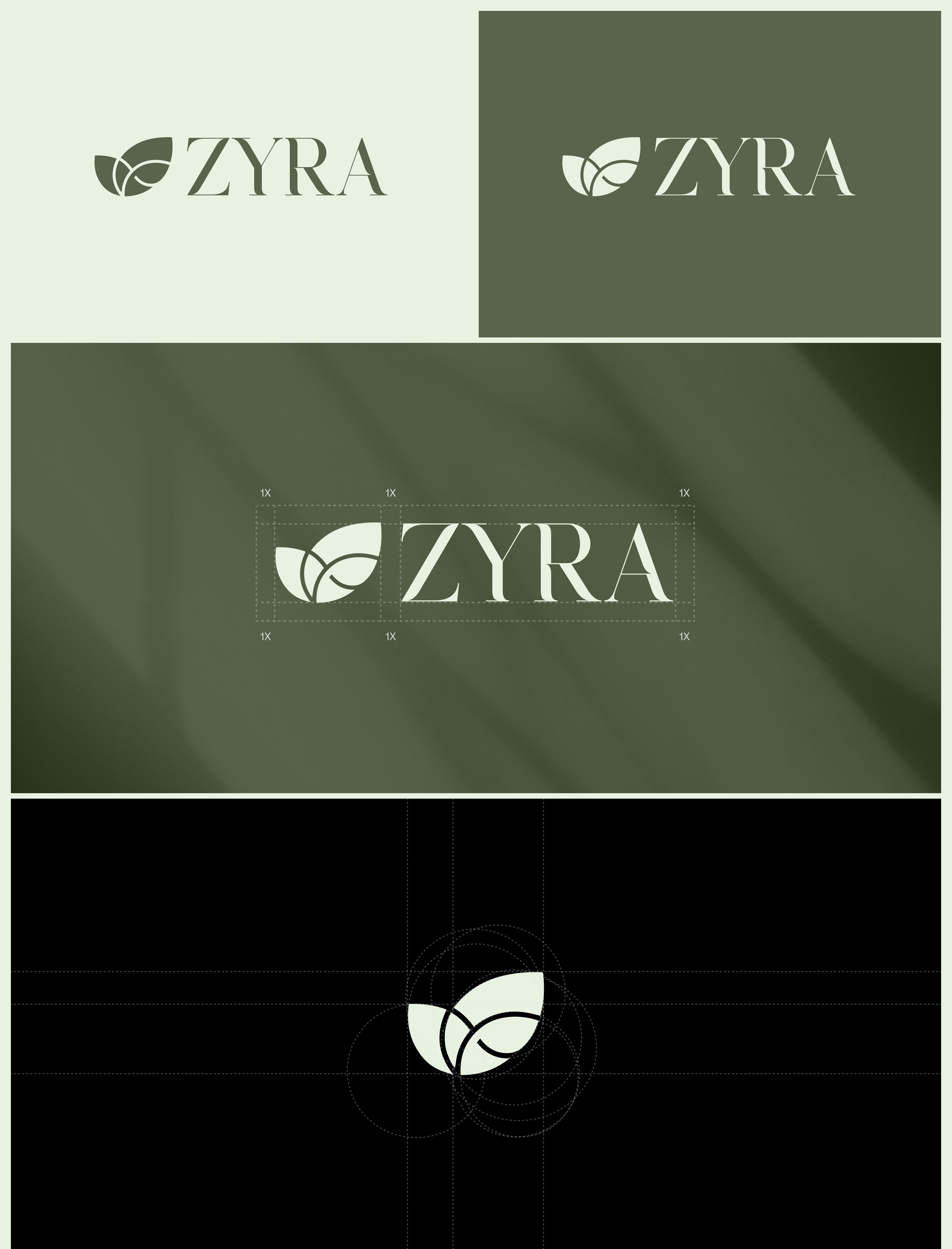
We went through four rounds before landing on the symbol. Early directions were too literal — illustrated botanicals that felt like a farmers' market. What we eventually built was a geometric abstraction: three overlapping leaf-petal shapes derived from circles on a near-mathematical grid.
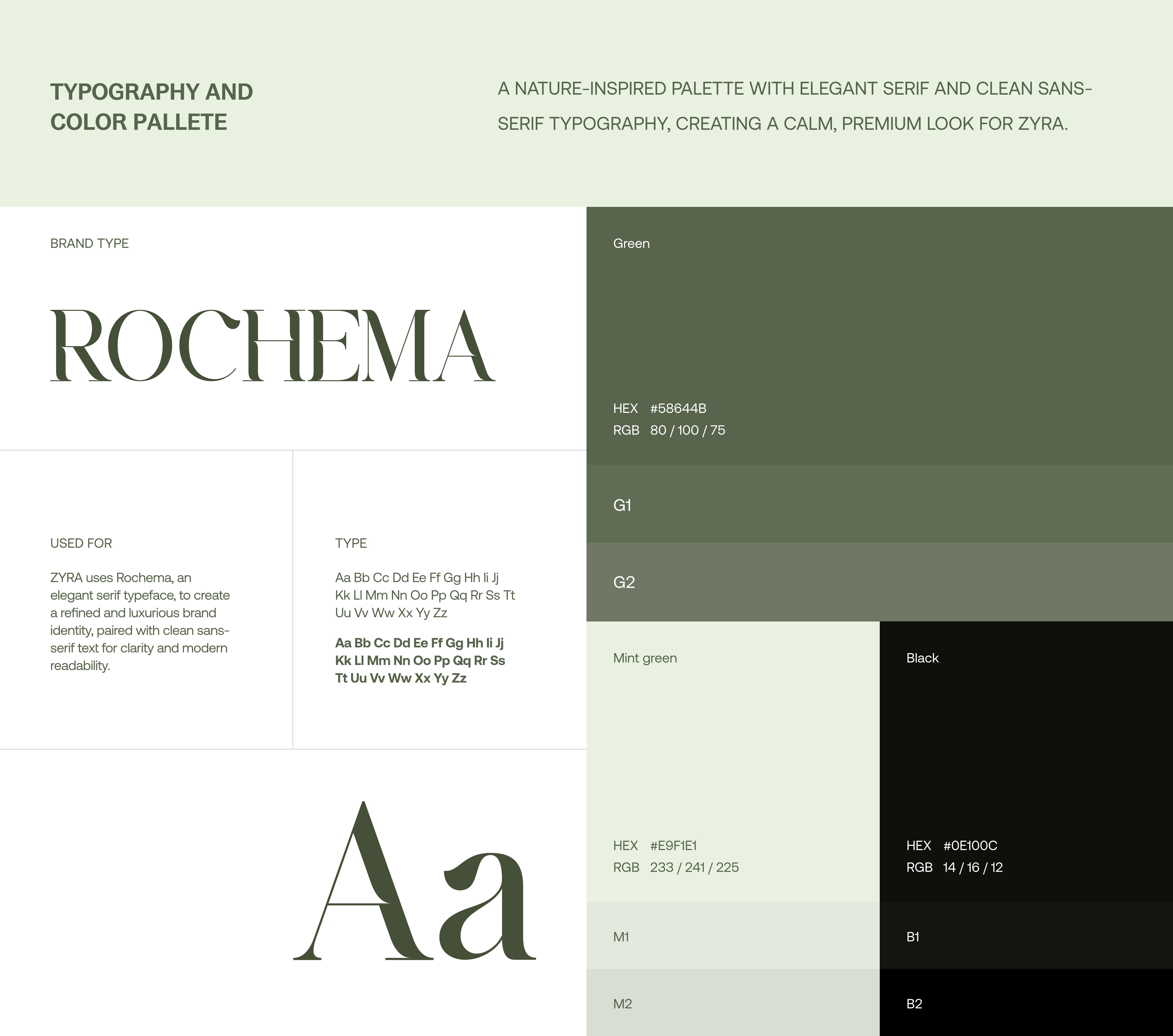
The grid isn't just design housekeeping. It's what makes the mark work at app-icon scale and at two metres on a poster without losing anything. We paired it with Rochema — an elegant serif with sharp contrast between thick and thin strokes — because nature needed sophistication layered on top of it, not competing with it.
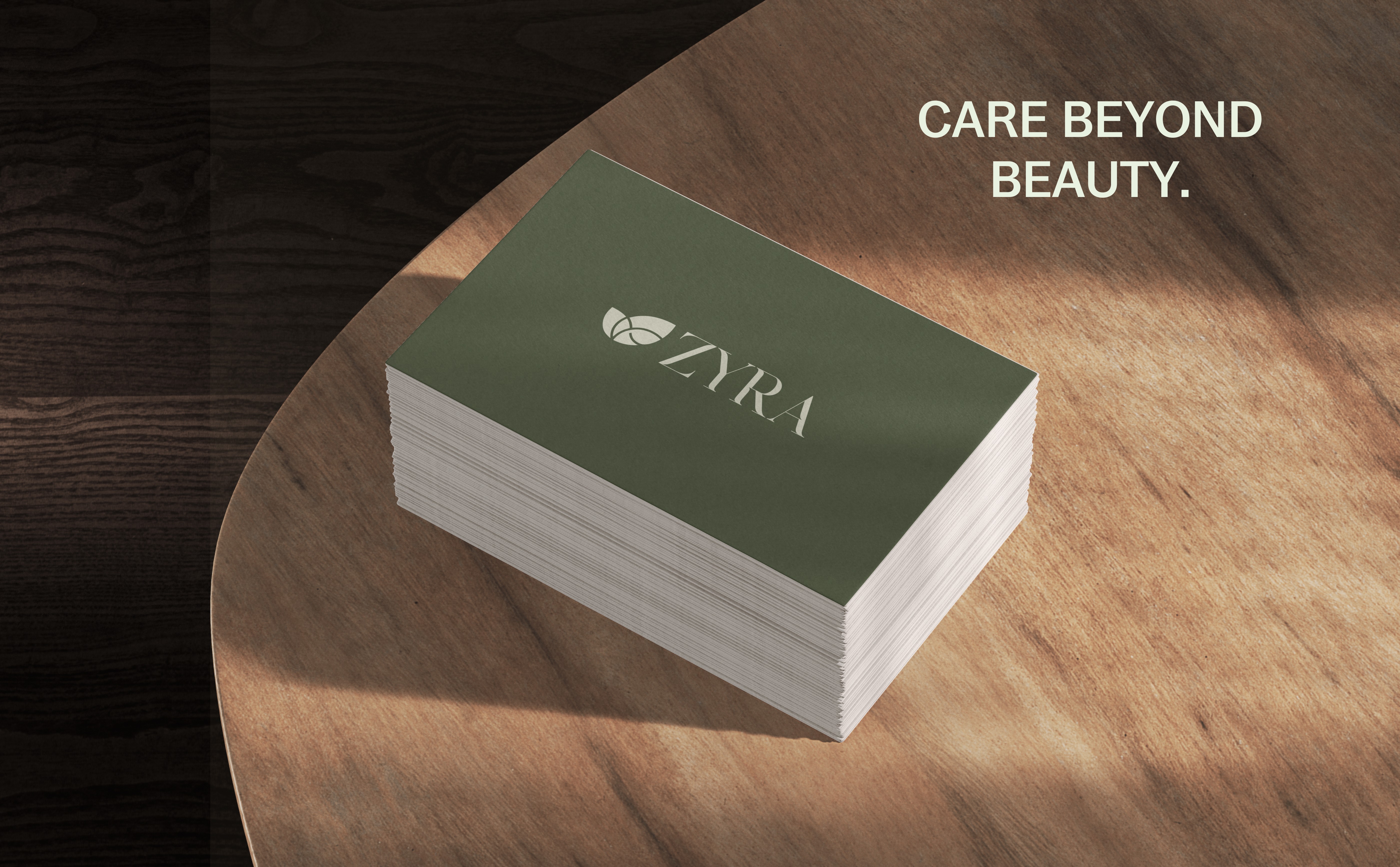
Forest green (#58644B) was always the anchor. The client had a strong instinct toward dark, mossy greens from the very first call, and honestly she was right — it's distinctive in a category drowning in spa whites and pastel blues. We added mint green (#E9F1E1) as breathing room. Same hue family, lighter value, which meant packaging could swing dark or light without the brand feeling fractured.
We almost added a warm amber accent. Three weeks in, it kept creeping into mockups. We cut it in the final round. The restraint is the point — every ingredient in a Zyra formula earns its place. The color system should say the same thing.
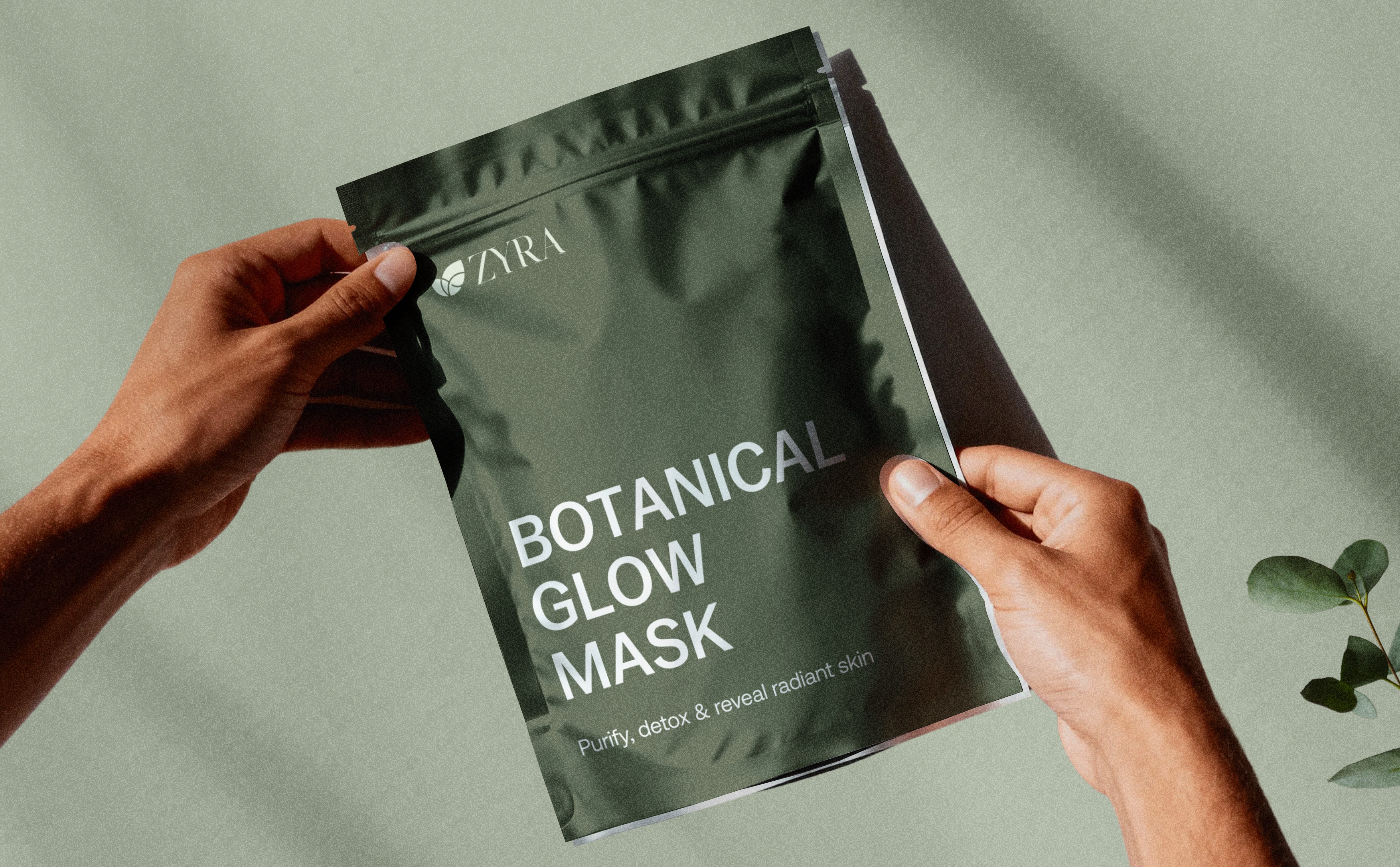
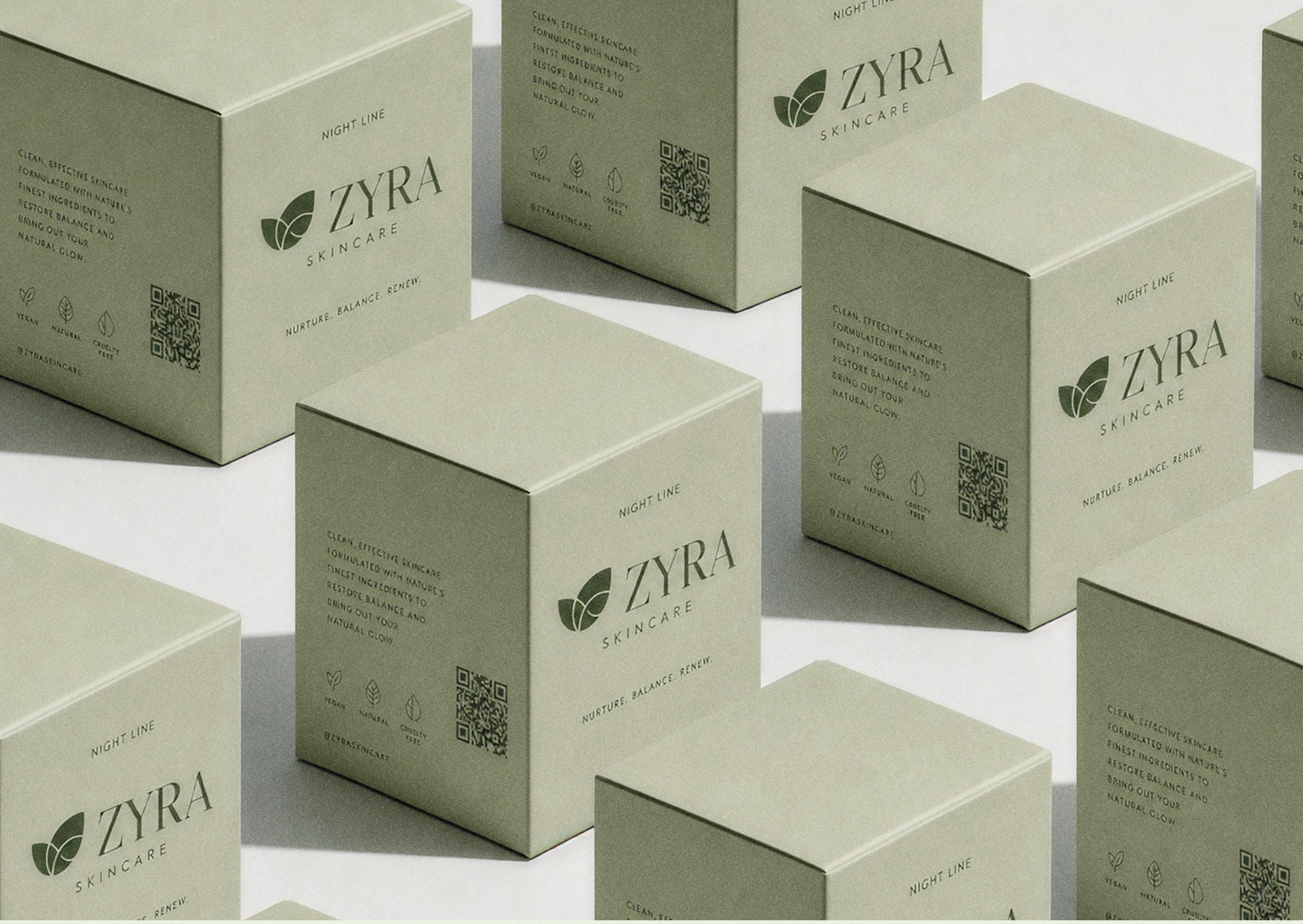
A lot of brand systems look great on a mood board and fall apart on product. The packaging brief was unforgiving: logo, product name, tagline, fill weight. Nothing else doing visual work. No ingredient lists styled in decorative fonts, no copy fighting for space.
The restraint wasn't laziness. A beautiful frosted glass bottle with a clean label reads as confidence. That same label on a cheap bottle would read as unfinished. The physical quality of the material carries half the message — the design just has to stay out of its way.
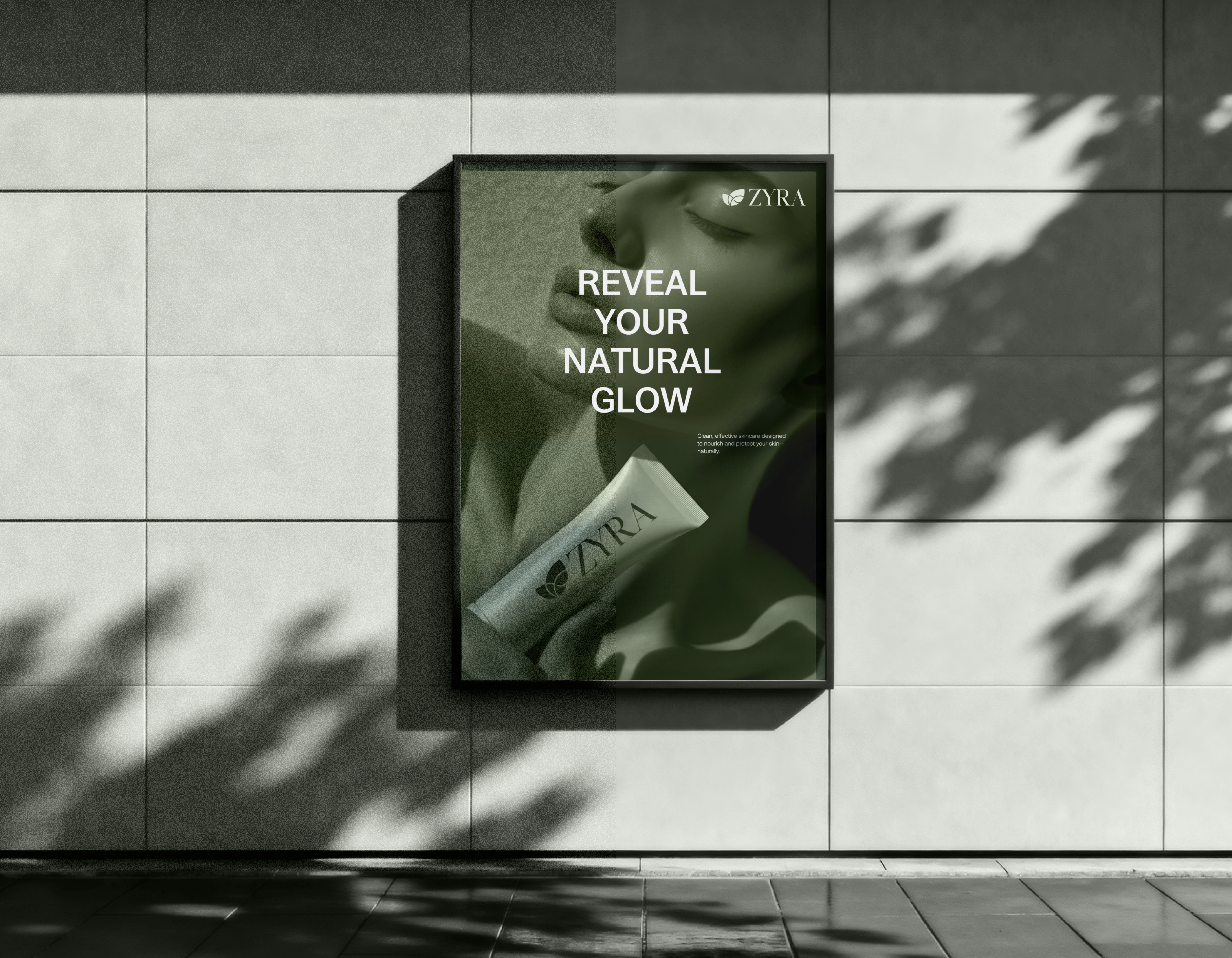
The real test of a brand system isn't the launch deck. It's what happens when you hand it to someone who wasn't in the room — and they make the right call anyway. OOH was our stress test. At poster scale, the logo almost disappears and the visual language has to carry everything. We ran a monochromatic green wash over the photography to keep the palette tight. It still felt unmistakably like Zyra before you read a single word.
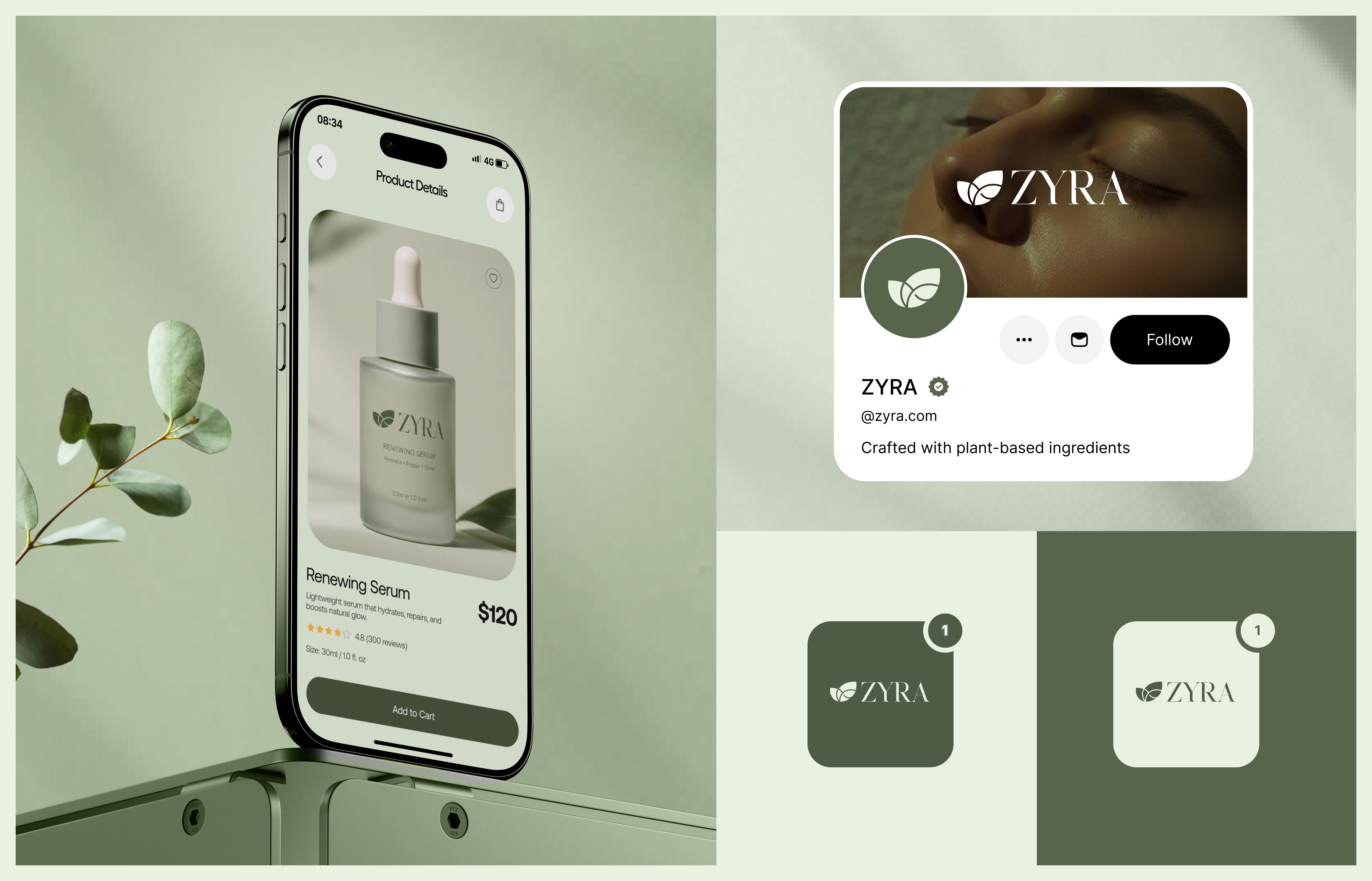
Physical packaging and digital UI are genuinely different media. The product detail page on mobile became our benchmark — if the brand felt right there, at 390px wide with system UI chrome around it, we knew it had actually crossed the divide. It did. The e-commerce site followed the same rules as the bottle: photography carries the emotion, type handles the information, the interface stays out of the way.
If we started over, we'd give the packaging dieline phase the same depth of exploration we gave the logo. We spent three weeks refining the mark — rightfully so — and then rushed the structural packaging decisions to hit a deadline. The boxes are good. They could have been better.
The argument we're glad we won was about color. Early in the project the founder asked for more warmth, more visual energy. We had about a week where we compromised, and the mockups looked fine but not right. Going back to our original direction — and explaining clearly why the restraint was the point — was the best decision we made. She agreed. Three months later, a competitor rebranded in the same category: pastel lavender, rose gold, a busy serif. Our identity looked more confident than ever
.